Graphic Design
ABOUT
During our internship, our team of three took on the inspiring challenge of providing a new brand identity for VOC Malderen—a non-profit rescue center for birds and wild animals. With a deep admiration for their essential work, we aimed to help raise funds and support their mission.
With creative freedom, we redesigned their brand while preserving their beloved owl logo. Our goal was to create a fresh and compelling identity that would resonate with the public, enabling VOC Malderen to expand their recovery quarters and provide care for more animals in need.
VOC Malderen has a noble cause where we tried to unite design and compassion to create a brighter future for the wildlife they protect and nurture!
GOAL
Our main focus was to create a clear and eye-catching branding strategy that would grab people’s attention and help VOC gain more visibility. We had a special emphasis on attracting young people, as their involvement would contribute to increased awareness and fundraising efforts.
Through our redesign, we aimed to make VOC more appealing and accessible to a wider audience. This mission was to elevate VOC’s presence, inspire action, and ensure the continuation of their invaluable work in caring for animals in need!

RESULT
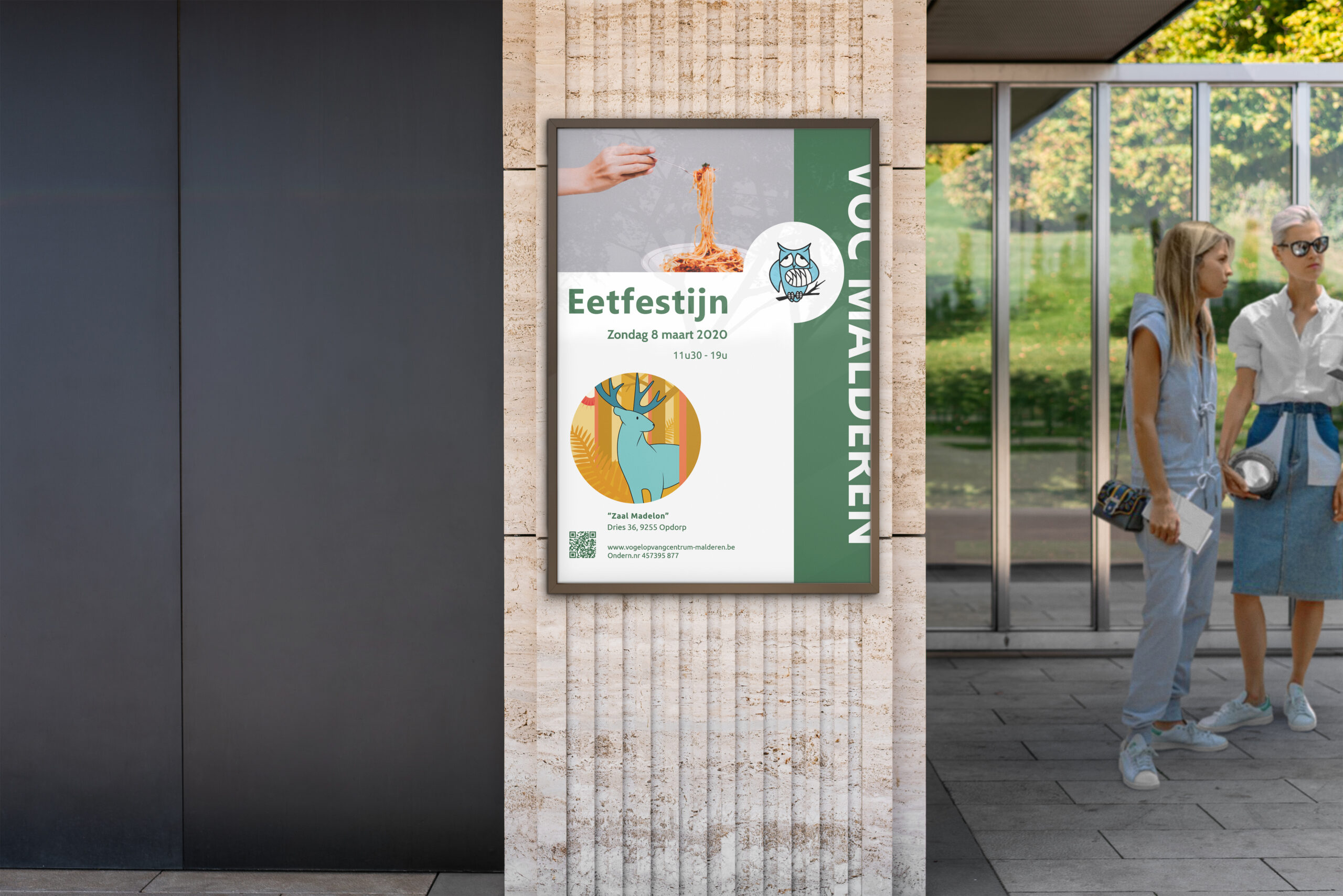
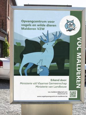
Through our efforts, we achieved a cohesive and visually engaging brand identity for VOC Malderen. Our primary color, dark green, beautifully contrasts with their light blue logo, creating a harmonious visual palette.
We took a creative approach to the typographic name of VOC, complementing their recognizable logo and adding an intriguing twist. Additionally, we designed a collection of animal illustrations that aligned with the logo, effectively communicating VOC’s mission while adding an extra touch of charm.
To ensure high-quality output, we meticulously reworked the logo in Illustrator, eliminating jagged lines and avoiding bleed issues when printed at smaller sizes.
The end result? A comprehensive redesign that encompassed various media expressions, including a house style guide, poster series, program booklet, folder, membership cards, company cards, lettering for a company car, signage, entrance sign, website, and Facebook page redesign.

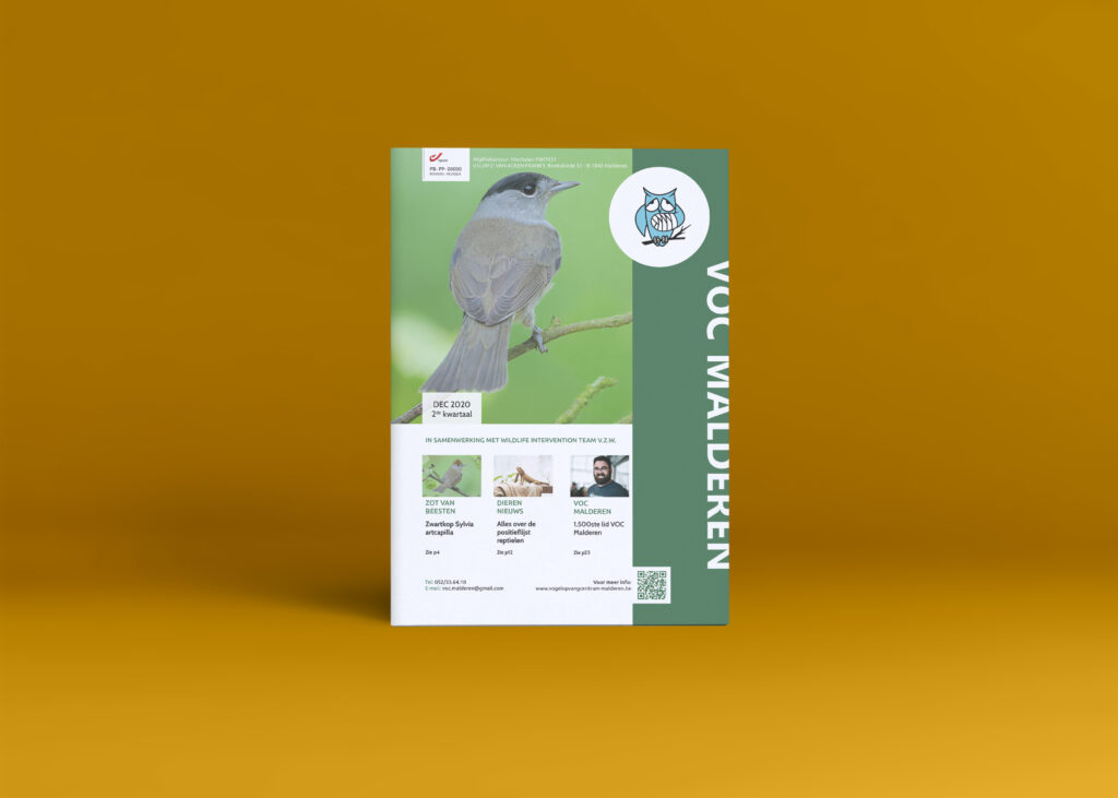
This is the cover of the program booklet, made with the same elements.

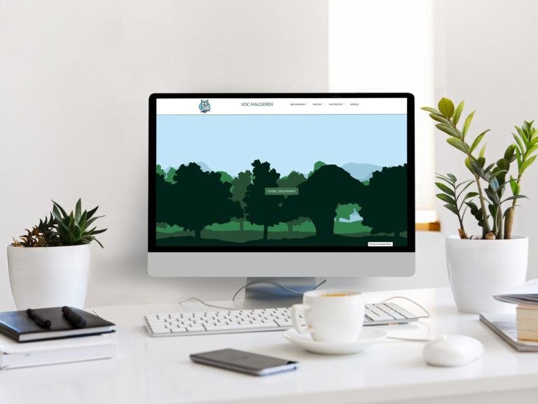
This is the home page of the redesigned website. You can take a look: https://www.vogelopvangcentrum-malderen.be
