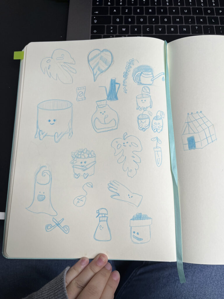
Talk to the…

Adobe Illustrator – Indesign

Introduction

“Talk to the…” is a project by Studio Still that explores visual communication through emoticons. I was asked to create a poster that presents a cohesive set of illustrated emotions, blending simplicity with strong personality.
Poster design - In the pot

This was the project:

This project involved curating and illustrating a complete emoticon set, each icon reflecting a unique emotion, and combining them into a unified visual story for print and digital use.

Challenge

To create a recognisable visual language using minimal shapes and clear expressions, while maintaining a consistent style across all emoticons.

My approach

I worked with a limited colour palette and refined geometric forms to distill each emotion to its essence. Visual balance and whitespace played a key role in giving each icon room to breathe within the layout.

RESULT

The result is a vibrant and charming set of emoticons that I genuinely love using myself to connect with others. I’m truly happy with how they turned out; each icon feels expressive and full of character. Designing the poster layout was a bit of a puzzle, but seeing it all come together left me feeling proud. I titled the series “De pot in”, a playfully witty name that captures its cheeky spirit perfectly. The final poster is bold, high-contrast, and instantly readable and the icons are also available as digital stickers for platforms like WhatsApp.

Project showcase

This is THE highlight section.

Among my emoticons, this one holds a special place as my personal favorite; the embodiment of adorable. I absolutely adore its expression. While my initial inspiration was the joy of a new leaf unfurling, its interpretation has evolved into something more nuanced. This emoticon is a testament to the varied ways emotions can be perceived and expressed.
Here’s a snapshot of my initial sketches for this series. The inspiration struck instantly, and I found immense joy in doodling, something that doesn’t usually happen so effortlessly. It’s a visual reminder of how inspiration can fuel creativity, turning a simple doodle session into the foundation of a vibrant project.

RESULT

The result is a vibrant and charming set of emoticons that I genuinely love using myself to connect with others. I’m truly happy with how they turned out; each icon feels expressive and full of character. Designing the poster layout was a bit of a puzzle, but seeing it all come together left me feeling proud. I titled the series “De pot in”, a playfully witty name that captures its cheeky spirit perfectly. The final poster is bold, high-contrast, and instantly readable and the icons are also available as digital stickers for platforms like WhatsApp.