
Graphic Design
ABOUT
In this graphic design project, the objective was to craft a captivating printed poster for an opera performance by Opera Ballet Vlaanderen. Extensive research was conducted to gain insights into the target audience and effectively communicate with them visually.
Throughout the design process, various illustration styles were explored, ensuring the creation of a unique and captivating visual experience. The incorporation of the current logo added a touch of familiarity and cohesiveness to the design.
With careful consideration and thoughtful design choices, the aim was to captivate the audience and convey the essence of the opera through the poster. The final result showcases the entire design process, from research to the creation of a visually stunning and engaging poster.
GOAL
My goal was to craft a modern poster that would entice younger audiences to embark on an enchanting journey through the world of opera. With a careful balance of magical and bittersweet elements, I aimed to capture the essence of the story while preserving its not-so-happy ending as a surprise.
Through captivating visuals, I sought to ignite a sense of wonder and intrigue, drawing viewers into the allure of the opera. Carefully balancing emotions, I conveyed both the magic and sadness, allowing the audience to experience the twists and turns of the story firsthand.

RESULT
With the young target group in mind, I proudly present two mesmerizing posters designed to captivate and engage. At the core of their design lies the striking silhouette of Russalka, meticulously crafted using a digital watercolor brush in Photoshop. The use of shades of blue creates a powerful connection to water, evoking a sense of melancholy that adds depth to the artwork.
The silhouette takes center stage, accentuated by a dark border that houses the accompanying text. This intentional framing directs attention and creates a visually impactful composition. As viewers encounter these posters, their imagination is ignited, capturing their attention and leaving them curious to uncover the secrets that lie within.
Join us on a journey of visual enchantment as we celebrate the allure of Russalka and invite you to delve into a world where beauty and mystery intertwine. Let these captivating posters be a testament to the power of design in captivating the hearts and minds of the audience.
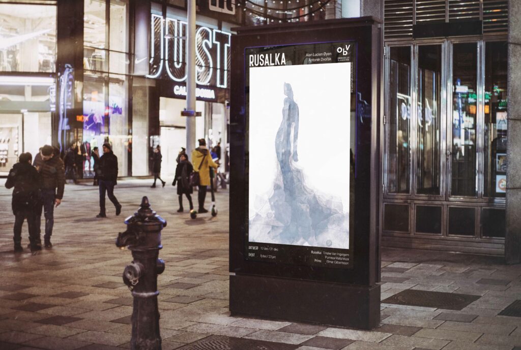
This is the poster that I turned in as the result.
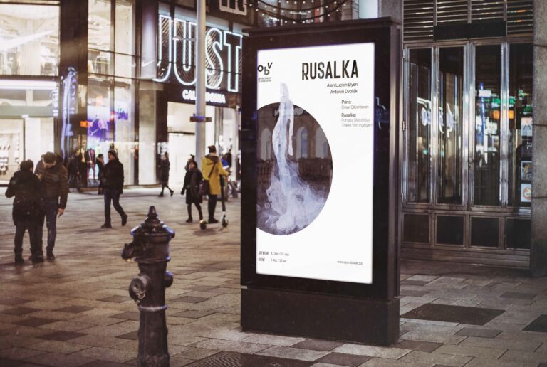
This poster is the other version of the first poster. In this poster, I used a hind of color with a circle behind the silhouette. The dark edges are also gone, which gives the poster a lighter look than the first one.