
Graphic design
ABOUT
The ‘GRAVITY’ pitch called for the creation of a captivating campaign image for a contemporary poster exhibition. This assignment gave me the opportunity to unleash my creative assets and explore new frontiers.
Finding the right tone of voice was crucial, as the design aimed to catch the eye of the target group—design/print lovers, creative addicts, and artists. Standing out was key, ensuring that the unique and specific character of the exhibition found its place in the design.
To truly shine, I ventured beyond recognizable existing styles, pushing the boundaries of visual expressions I was already familiar with. The objective was to develop my own experimental visual style, capturing the essence of the exhibition’s innovation and creativity.
For this pitch, I designed an impactful poster (A) that commands attention and leaves a lasting impression. Additionally, I created a distinctive promotional tool (B) of my choice, using it as a powerful extension of the campaign.
GOAL
In the ‘GRAVITY’ exhibition, the theme is interpreted in the broadest sense, encompassing ideas of attraction, repulsion, and more. The goal is to explore this concept through a wide range of experimental processes.
The only requirement is that the campaign image must be based on an innovative and pre-determined experimental process. This can involve physical, chemical, spiritual, analog, digital, or a combination of these processes. The focus lies not only on the visual and aesthetic output but also on the concept and the journey of image-making itself.
RESULT
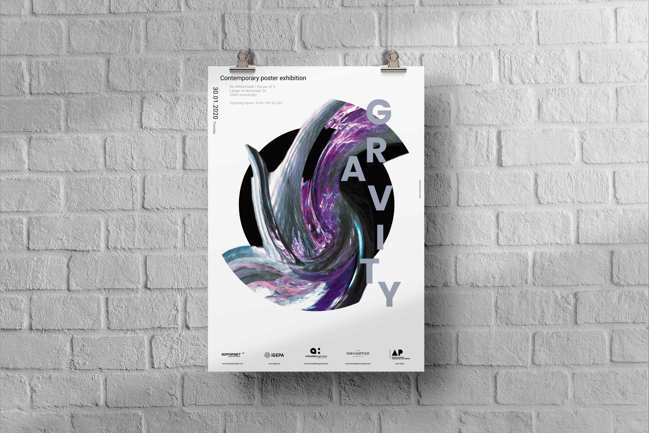
In my experimental journey for the ‘GRAVITY’ campaign, I shattered a mirror with a crowbar, using the thick shards to create a captivating composition on a white canvas. The edges of the shattered pieces revealed intriguing patterns and swirls, which inspired me to delve further into the artistic process.
Utilizing Photoshop, I employed two effects to enhance the visual impact of the photograph. The twirl effect played a prominent role in creating mesmerizing twists, while the liquify tool allowed me to refine the edges with precision. To amplify the overall aesthetic, I gave the image a purple-blue hue, reminiscent of the vastness of space, and heightened the details within the twists.
Striving for an abstract and modern poster, I incorporated unique font choices. By creating two vertical lines of text, they act as guides, leading the viewer’s eye along the flow of my artwork and placing it at the center of the poster. To further emphasize this effect, I added a black circle as a backdrop, drawing attention to the most captivating part of the creation and enticing the viewer to gravitate towards the heart of the poster.
Immerse yourself in the mesmerizing allure of abstraction and modernity as you explore the depths of ‘GRAVITY’. Let your imagination soar and be captivated by the enigmatic beauty that lies within this thought-provoking poster.
RESULT
In my experimental journey for the ‘GRAVITY’ campaign, I shattered a mirror with a crowbar, using the thick shards to create a captivating composition on a white canvas. The edges of the shattered pieces revealed intriguing patterns and swirls, which inspired me to delve further into the artistic process.
Utilizing Photoshop, I employed two effects to enhance the visual impact of the photograph. The twirl effect played a prominent role in creating mesmerizing twists, while the liquify tool allowed me to refine the edges with precision. To amplify the overall aesthetic, I gave the image a purple-blue hue, reminiscent of the vastness of space, and heightened the details within the twists.
Striving for an abstract and modern poster, I incorporated unique font choices. By creating two vertical lines of text, they act as guides, leading the viewer’s eye along the flow of my artwork and placing it at the center of the poster. To further emphasize this effect, I added a black circle as a backdrop, drawing attention to the most captivating part of the creation and enticing the viewer to gravitate towards the heart of the poster.
Immerse yourself in the mesmerizing allure of abstraction and modernity as you explore the depths of ‘GRAVITY’. Let your imagination soar and be captivated by the enigmatic beauty that lies within this thought-provoking poster.

This is an additional design that was part of the brief. This is the extra promotional tool in the form of a wristband needed to enter the exhibition.
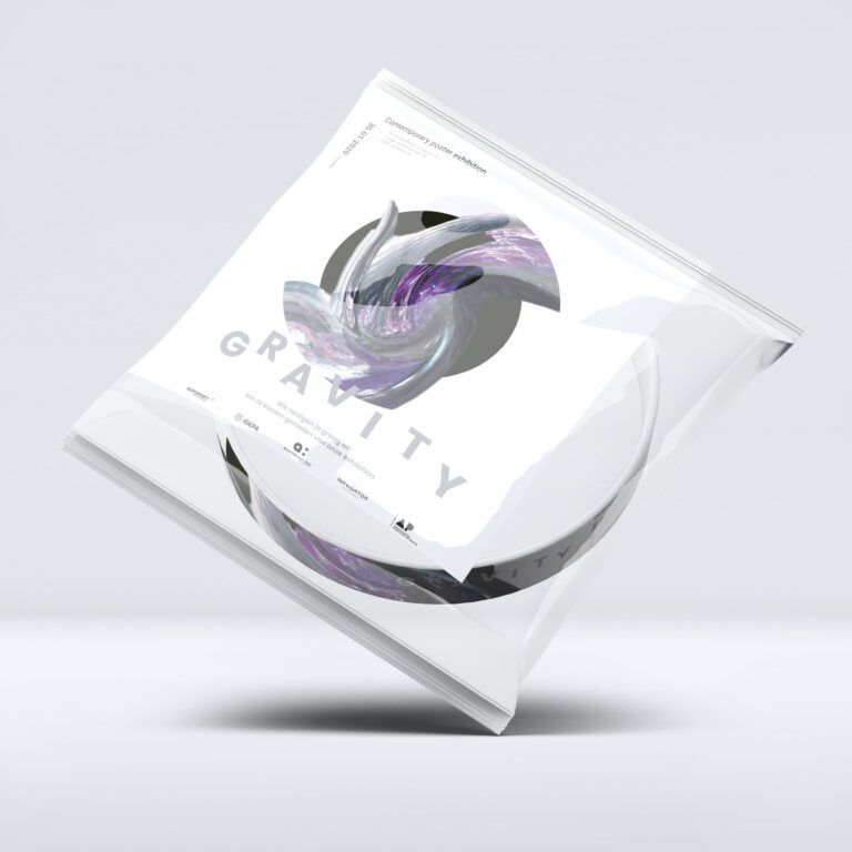
This is an additional design that was part of the brief. This is the packaging design of the wristband needed to enter the exhibition.