
Graphic design
ABOUT
The brief went as followed: You will design a poster for an international floral event called Fleuramour. Your design should be completely made within an existing visual style(*).
(*) A visual style can be understood in terms of time, geography, and/or aesthetics
GOAL
The project would go as followed:
As the first step of this assignment, you will examine 8 existing visual styles in such a way that you have sufficient input from your research to start designing in that style yourself afterward.
At the first consultation, the accompanying lecturer will choose 1 out of the (at least) 8 existing visual styles you researched and in which you will have to make this assignment. The content to be designed is given and may be handled creatively but the entire content must be reflected in the design.
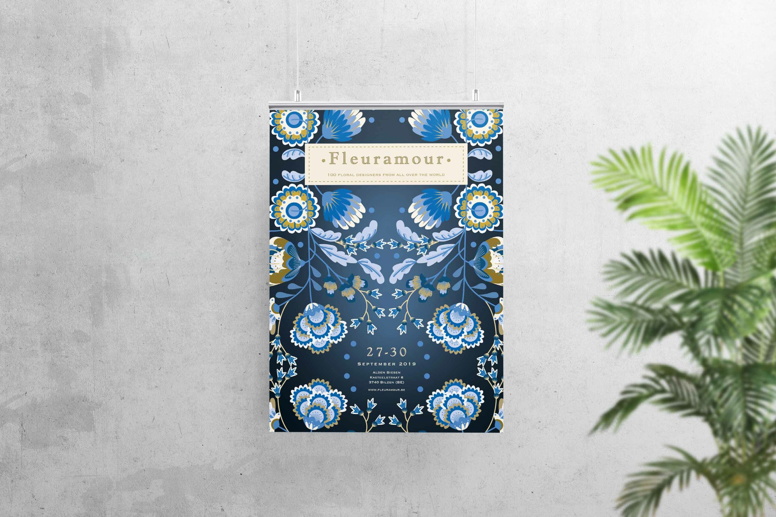
RESULT
I’ve created a poster with the visual style Arts And Crafts*, but I mixed it with a more modern look to appeal to the audience. My main inspiration was the style of Pip Studio, who are using various patterns of flowers throughout their designs.
I made a repeated pattern with detailed flowers for the poster and used a font that resembles the old-styled serifs used in that time period.
( * The practitioners of the movement strongly believed that the connection forged between the artist and his work through handcraft was the key to producing both human fulfillment and beautiful items that would be useful on an everyday basis; as a result, Arts & Cra s artists are largely associated with the vast range of the decorative arts and architecture as opposed to the “high” arts of painting and sculpture. The Arts & Crafts aesthetic varied greatly depending on the media and location involved, but it was influenced most prominently by both the imagery of nature and the forms of medieval art, particularly the Gothic style, which enjoyed a revival in Europe and North America during the mid-19th century.
https://www.theartstory.org/movement/arts-and-crafts/ )
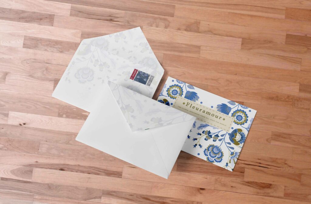
This is the design made for the invitation. I’ve used the same elements of the flowers throughout.